News & Media
Changing Over 'CI Guidelines'
The Doosan Group inaugurated its current Corporate Identity (CI) program in 1996, and now a decade later, a new set of Doosan Corporate Identity guidelines has been published with additions and revisions to the original CI manual. The Group's main business lines have shifted from consumer goods to technology intensive industries during the past ten years, raising the need for a more suitable global CI. The original CI manual does not adequately support communication at the individual BG level and is limited in conveying the Doosan brand with consistency. For these reasons, management has decided to revise the Corporate Identity guidelines.
The "Doosan-Daewoo" co-brand currently used outside Korea will be replaced with the single "Doosan" brand from the beginning of 2007. As part of a new global brand management plan, Doosan Infracore is supplementing the CI manual in accordance with the Doosan Group's revised CI guidelines. This overall project is expected to elevate the stature of the "Doosan" brand.
Philosophy behind the New Doosan Logo
The Doosan Corporate Identity is presented visually as three squares, which stand for the enduring spirit of a business organization that has succeeded for the past 110 years. They also represent a commitment to making life even better in the future. The squares are angled to indicate forward motion, suggesting a progressive, forward-looking spirit and constant innovation for the benefit of all.
The blues and green convey a corporate philosophy based on trust. These are the colors of an enterprise that always stands by its employees, business partners and customers. The logotype appears in powerful italic English typography, conveying Doosan's progressive character as a major global player.
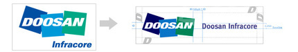
What Has Changed?
1. Horizontal Alignment of the Signature
The original CI signature was placed below and partially to the right of the triple-square logo, forming a two-tiered structure. However, the new signature is positioned directly to the right of the logo, and the "Infracore" working has been extended to "Doosan Infracore."
① Flexibility in Application
The space between the logo and the signature can be extended to accommodate specific design requirements when using the CI. However, the baseline must remain constant, and the logo and signature must be separated by a minimum distance of 1.5D ("D" is unit of measurement equal to the height of the initial letter in the logo) in any event.
② Inclusion of the BG Name
The official name of a Business Group (BG) may be included in the corporate signature to indicate a specific business area, but the abbreviation "BG" is omitted. When the BG name is used, "Doosan Infracore" appears in "Doosan Blue," the same color as the leftmost square in the logo, while the BG name is in "Doosan Light Blue," the color of the center logo square. The English name for the Machine Tool & Factory Automation BG has been shortened to "Machine Tools," and the Industrial Vehicle BG is expressed as "Forklifts."
2. New Font
The company name in the original CI was presented in a unique bold italic font, but now the font has been changed to FF meta, which is familiar to most people.
3. Diverse Color Palette
The original CI guidelines stipulate exclusive colors to convey a unified and consistent image when designing various advertisements and public relations materials. The revised guidelines include primary colors that maintain consistency in the graphic elements and fonts. In addition are a wide range of accent colors that can be used, along with metallic colors for special emphasis. The permissible tones now range from bright to neutral.
The color stipulations not only apply to print media but also to on-screen displays and other digital media, ensuring that high quality, consistent color schemes are used.
4. Imagery and the Doosan "Edge"
It is important for the name "Doosan Infracore" to be accompanied by consistent photo images to provide a distinctive brand look. Therefore, guidelines have been added on the selection of photographic styles and subjects used on various PR materials. The placement of the Doosan "Edge," a unique element derived from the first block of the Doosan logo, is also covered in the new guidelines.
① Images Blending People with Technology
Images that show people and technology in concert project the promise that Doosan has made. The juxtaposition of black-and-white and color photographs is an important way to present people and technology imagery.
② Use of the Doosan "Edge"
The Doosan "Edge," or angle of the first square in the logo, maintains an 18-degree rotation, but the thickness can be increased or decreased. The "Edge" always "hangs" from the right side of the PR material on which it appears. The "Edge" can use any of the hues included in the color palette.